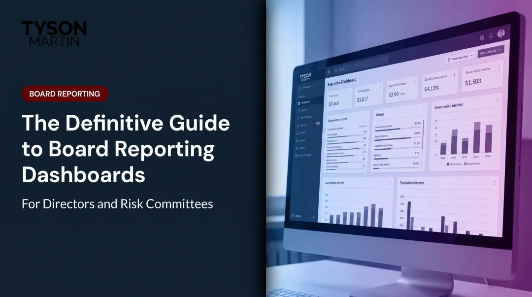
Introduction
Picture the scene: the CISO walks into the board meeting with a 40-slide deck. Vulnerability counts, patch percentages, mean time to detect, alert volumes. An hour later, the board adjourns without a clearer sense of whether the organization is at acceptable risk than when they arrived.
The problem is not the data. It is the dashboard.
According to NACD's 2026 Cyber Risk Oversight research, 43% of public company directors rated improvements in the quality of management's cyber-risk reporting as very or extremely important.
Gartner's 2024 Board of Directors Survey found that 67% of boards rate their current practices and structures as inadequate to oversee cyber risk — even as 93% recognize it as a direct threat to stakeholder value.
A board-ready technology dashboard is not about prettier charts or more metrics. It gives directors a stable, credible view of cyber risk, technology spend, and operational resilience, enabling sharper questions and faster decisions when it counts.
This article covers what board-ready actually means, which metrics belong, how to design for a non-technical audience, and how to embed decision rights that hold under real incident pressure.
Key Takeaways
- Board-ready dashboards show trend and direction — not technical activity or raw operational data
- The right dashboard includes five to seven stable metrics tied to risk, spend, resilience, and strategic progress
- A non-technical director should scan the page in under five minutes and walk away knowing the organization's posture
- Put decision rights and escalation thresholds on the dashboard itself — not buried in a governance document
- Most dashboards fail because they are built for the CISO's comfort, not the board's decisions
What Makes a Dashboard "Board-Ready" (and Why Most Aren't)
A board-ready dashboard gives directors enough signal to fulfill their oversight duty without requiring technical expertise to interpret it. That makes it a fundamentally different artifact from an operational dashboard built for a security operations center or IT team, which tracks activity rather than posture.
The distinction matters. Management needs granular detail to run day-to-day operations. The board needs trend, context, and a clear answer to one question: are we inside or outside the risk tolerance we agreed to?
When directors look at a technology dashboard, they are trying to answer three things:
- Is cyber risk moving in the right direction?
- Is the technology investment generating defensible value?
- Could the organization recover from a serious incident?
Most dashboards fail at this because they are built around what security tools make easy to export, not around the governance questions directors actually need to answer.
Board-Ready vs. Operationally Ready
The practical difference is straightforward:
| Operational Dashboard | Board-Ready Dashboard |
|---|---|
| Open tickets and patch status by system | Risk posture trend over 8 quarters |
| Mean time to detect and alert volumes | Position relative to agreed tolerance |
| Active vulnerability counts | What changed since the last briefing |
| Security tool coverage rates | Whether recovery targets were met |
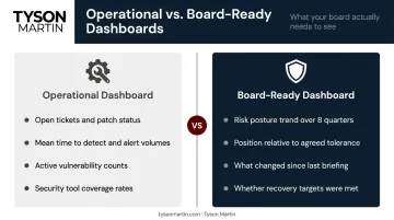
NACD states explicitly that while operational metrics can provide insight, the board's focus should remain on strategic indicators that reflect the organization's overall approach to cyber risk — and that management should translate technical data into business-relevant terms to enable informed board discussions.
In practice, that translation gap is where most board reporting breaks down — and it is the gap that determines whether directors can actually exercise oversight or are simply receiving information.
What Belongs on a Board-Ready Cyber and Technology Dashboard
Every metric on the dashboard must connect to a question the board is responsible for answering. A useful filter: ask, for each proposed metric, "What would the board do differently if this number moved?" If the answer is nothing, cut it.
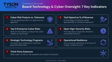
The Five to Seven Indicators That Belong
Tyson Martin's framework for board-level cyber and technology dashboards centers on a one-page scorecard with a small set of stable, outcome-linked indicators. Framed as the board-level questions they answer:
Overall cyber risk posture vs. agreed tolerance — Are we inside the risk appetite the board approved? Not a raw score, but a position on the tolerance line with a trend direction.
Technology spend as a percentage of revenue, with trend — Is investment moving in proportion to growth and risk exposure?
Top 5 enterprise cyber risks, written in business impact terms — What could actually hurt the business, and is that list getting shorter or longer?
Open high-severity risks older than a defined threshold — Are critical issues being resolved, or are they aging past acceptable windows?
Status of two to four strategic technology programs — On track, at risk, or off track — and what could slip?
Operational resilience — Can we serve customers if a key system fails, and how long did recovery take in the most recent test or incident?
Third-party exposure summary — Which critical vendors represent the most concentrated dependency, and are they covered by assurance?
What to Exclude
Clutter on a board dashboard signals that the presenter has not done the editorial work. Cut:
- Vanity metrics: tickets closed, pages scanned, blocked attack counts
- Single-point-in-time snapshots with no trend
- Any metric requiring technical translation before a director can interpret it
Raw vulnerability counts are a particular trap. As Tyson Martin notes, vulnerability numbers spike when scanning improves — punishing visibility rather than rewarding it.
Show Eight Quarters of History
A current number without context is nearly useless for governance. Each key indicator should carry at least six to eight quarters of history so the board can see direction and velocity. A visible tolerance line on each trend chart tells directors instantly whether performance is inside or outside the range they approved.
That historical context only lands if directors can read the chart without a technical interpreter — which brings everything back to language.
Cyber Risk in Plain English
The single biggest design decision in a board-level dashboard is language. Technical terms belong in operational reports. For board reporting, replace them:
- "CVE count" → "Critical vulnerabilities unresolved for more than 30 days"
- "MTTR" → "Time to recover from our last major outage vs. our target"
- "Security posture index" → "Are we inside the risk tolerance the board approved?"
- "MFA coverage rate" → "Because MFA expanded, we reduced account takeover risk, which protects funds movement and sensitive workflows"
The pattern that works consistently: Because we improved X, we reduced the chance of Y, which protects Z.
A Note on AI Risk Indicators
McKinsey's 2025 State of AI survey found 88% of organizations now use AI regularly in at least one business function, and 51% had already experienced at least one negative consequence from that use.
The governance gap is striking. Deloitte's Board Practices Quarterly reports that AI governance rose to 35% of audit committee agendas — yet only 22% of large-cap boards receive a current inventory of the machine learning and generative AI models running across the company.
At minimum, the board dashboard should answer two questions: how many critical business processes depend on AI or third-party models, and who is accountable by name if one of those models fails or produces harmful output.
Dashboard Design Principles That Work in the Boardroom
The One-Page Rule
The primary board view should fit on a single slide or screen. Supporting detail — drill-downs, source data, methodology notes — lives in an appendix. Directors review board packs on laptops and tablets. A dense 10-page technical report will be skimmed at best.
Visual Hierarchy
Tyson Martin's recommended one-page structure follows a consistent format:
- Executive summary line at the top: "Risk posture is inside tolerance and improving" or "Tech spend increased 12% — explained below"
- Five to six metric tiles with trend lines and threshold markers
- "What changed since last briefing" — one to two things that moved materially, with a plain-English explanation
- Decisions needed — funding, policy, risk acceptance, exceptions
Each tile shows the metric, the current status (color-coded), the agreed threshold, trend over three to four quarters, and the accountable owner at the management level.
Color Discipline
Use a consistent, simple code — and never move the thresholds to avoid showing red:
- Green: Within tolerance
- Amber: Approaching threshold; two consecutive worsening cycles or a near-miss
- Red: Outside tolerance; breach, repeat breach, or expired exception
When colors are tied to board-approved thresholds rather than management discretion, the dashboard becomes a decision tool rather than a debate about risk interpretation.
Consistency Over Sophistication
A board that sees the same structure every quarter can spot trends at a glance. When a report gets redesigned between meetings, directors spend their time reorienting to the format — not governing.
This is a core principle Tyson Martin applies across his board advisory engagements: dashboards that hold their structure through leadership changes and incidents alike. When the format is stable, a single off-color tile draws immediate attention. That's the point.
Building in Decision Rights and Escalation Thresholds
A board-ready dashboard encodes the decisions the board has already made: what risk tolerance they approved, what thresholds trigger escalation, and who owns each indicator. When a metric turns red, the board should not need to debate what to do next — the escalation path should already be agreed and visible.
What a Well-Designed Tile Shows
Each tile or section should include:
- The metric and current status
- The agreed threshold ("in appetite" vs. "out of appetite")
- Trend direction over the past three to four quarters
- The accountable owner at the management level
- What action is triggered if the threshold is breached
Done right, each tile functions as a standing decision — not a question the board needs to re-litigate at every meeting.
The Escalation Ladder
Tyson Martin implements a four-level escalation framework with triggers tied to business impact rather than technical severity. The key design decisions to pre-agree before any incident:
- Who can approve containment actions that may disrupt systems
- When to engage outside counsel and cyber insurance providers
- Who owns external communications and customer notifications
- What the board chair receives in the first update
- Whether a given severity level requires an emergency board session, a committee review, or management action with board notification
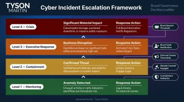
These decisions need to be made in a conference room, not a war room. The first 30 minutes of a serious incident often determine whether the next two weeks are controlled or chaotic — and a board encountering the dashboard for the first time during a crisis is already behind.
Common Dashboard Failures to Avoid
The most frequent failure: the CISO or CIO builds the dashboard from existing tool outputs rather than from the board's governance questions. The result is technically accurate, strategically useless reporting that leads to either micromanagement or disengagement.
Before a rebuild, dashboards Tyson Martin encounters typically show:
- All-green metrics with no prioritization — nothing stands out, so nothing gets decided
- Activity reporting instead of exposure — "we closed 97% of critical vulnerabilities" rather than "a single unpatched system can interrupt customer onboarding for 48 hours"
- No link to revenue, service, or safety — IT output described without business context
- No trend lines tied to business change — month-to-month numbers without context from a product launch, cloud migration, or acquisition
- No third-party concentration view — vendors tracked individually, but dependency on any single provider not visible
Two process failures compound these content problems. Unlike the metrics issues above, these erode board confidence in the reporting itself — not just what it says.
Instability is the first. Dashboards that change their metrics, definitions, or structure from meeting to meeting make trend analysis impossible. Stable definitions and a consistent cadence (quarterly board pack, monthly executive summary) are non-negotiable.
Data reconciliation gaps are the second. When the technology dashboard uses different spend figures than the CFO's financial report, the board loses confidence in both. Technology reporting should reconcile against finance, with a short data dictionary in the appendix documenting where each number originates.
How to Build or Rebuild Your Board Dashboard
The starting point is a single working session with the board chair or audit/risk committee chair to identify the five to seven questions the board must be able to answer after reviewing the technology section of each board pack. Those questions become the architecture for the dashboard.
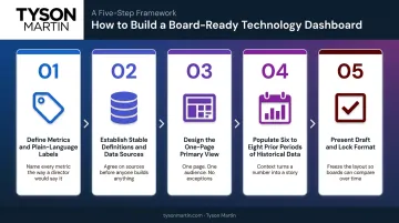
The build sequence:
- Define the metrics and their plain-language labels
- Establish stable definitions and data sources, reconciled against finance
- Design the one-page primary view with status, trend, and escalation hierarchy
- Pull historical data to populate at least six to eight prior periods
- Present a draft to the full board with an explicit invitation to adjust before locking the format for the next four quarters
The board approves the thresholds and the escalation ladder. After that, the dashboard follows the same structure each quarter. Colors reflect board-approved tolerances; trend lines show whether risk is worsening, holding, or improving.
Getting that structure in place is straightforward once the governance foundation exists — but many organizations are starting from scratch.
Organizations without an internal CISO, or with a security function that has not previously reported at board level, benefit from an outside perspective to bridge the gap between technical operations and board governance. Tyson Martin works with boards and executive teams in this capacity, building the reporting infrastructure and decision rights framework that turns a scattered technology briefing into a governance asset the board can rely on, quarter after quarter.
Frequently Asked Questions
What are the three types of dashboards?
Strategic dashboards (board-level) support oversight and decision-making. Operational dashboards support management and day-to-day execution. Analytical dashboards enable deep-dive investigation of specific problems. Board-ready technology dashboards are strategic — designed for oversight, not monitoring.
What is replacing dashboards?
AI-assisted narrative reporting and conversational analytics are augmenting traditional dashboards, letting board members ask natural language questions of integrated data platforms. The format evolves; the governance requirements — clarity, trend visibility, board-appropriate language — do not.
What is the difference between an operational and a board-ready cybersecurity dashboard?
Operational dashboards track activity — alerts, patch rates, ticket volumes — for security and IT teams managing day-to-day work. Board-ready dashboards show posture, trend, and risk relative to agreed tolerances, giving directors what they need to fulfill oversight responsibility without requiring technical expertise.
How often should a board-level technology dashboard be updated?
Align updates to board meeting schedules — quarterly for most, with a monthly one-page summary in fast-moving environments. Cadence matters less than consistency: the same metrics, measured the same way each period, are what let directors spot genuine trends.
What should a board do if a dashboard metric turns red?
The response should be documented before any metric turns red. Pre-agreed escalation thresholds specify whether a red indicator triggers a full board session, a committee review, or management action with board notification. A well-designed governance framework means directors never have to improvise when a signal appears.
How many metrics should a board-ready technology dashboard include?
Five to seven key indicators for the primary board view — enough to give directors a complete posture picture. Any metric requiring technical translation before a director can interpret it signals the dashboard is reporting operational data rather than governance signal.